
FAVORITE OF THE WEEK AND WINNER AND OF gaia_gaiagold 1,000,000
GALAVANT MAN with his Space paranoids Sora
1st Place 1/5
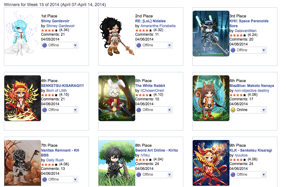
This is pretty much an exact copy of a previous Gardevoir except done with one worse item and minus the pokeball. looks close to accurate but I'm not happy this placed first at all
2nd Place 4/5
Great Avatar I love all the detail in it! Although I think some playing with layering might have been able to be done. sadly you couldn't get the big bust because gaia doesn't offer it but that doesn't distract from the avatar. Definitely worth placing this week in top 10 and see why it did place but not sure on its position.
I would just like to know if you tried protective fantasy armor on her feet at all or some kind of anklet? to give more detail to the boots. Also I am a lover of backgrounds and think that could have only added to your avatar!
3rd Place 4/5
My favorite of the week based off of my love for KH. Its a great layered avatar! I have tried to make this in the past but it was only for fun considering i was looking at someone else's creation. Yoiu did great with the body layering and made the character feel like the character. Only problem I do have with it is that you used art ref/ and in game ref. In game his hair never looks brown and by adding the life bar blue skin and background you made it in game so i would have preferred to have blue hair.
4th Place 3/5
Hmm the higher of the two that placed. I honestly never know how this happens I always look through all the pages first before voting but I guess we have a lot of voters that don't take it as seriously as me.
There is a good amount of detail here in this avi that does make it better than the later placed one. I like the hair you made compared to the other for sure. But I kind of wish the two entries were combined. I don't like the wings that look like they were used to create the yellow designs by the waist. The background makes the avi look worse. there is a way to get an orange glow on backgrounds with the right layering of backgrounds so maybe something you should try it might make your avatars come to life. Also the eyes don't make me feel like this is the character. her eyes have more life to them.
5th Place 4/5
CONGRATS on your second alice in wonderland placement. Its a cute avatar and looks pretty good as well. Definitely deserving of its placement as only very few people know about what I am going to tell you. Im just going to get really knit picky with you. Mainly because When it comes to short avatars I hate seeing them the same height as regular designed avatars. Fremere's has a pose that makes avatars short. and you can find the right items to layer to make feet. For me that would have upped your avatar so much! Also I would have liked to see the pink eyes

6th Place 5/5
Great detail on everything this week! definitely deserving of its placement in top 10 but maybe a little higher up! You got great details down and added a background which is nice to see! Only minor details for me to complain about and its only me being picky but maybe you will agree? Marionette bangs matches that beautiful saturated brown rather than the shop hairs white base brown. so maybe those bangs with an item hair would have worked nicely. as far as the yes in the ref I could really see they didn't look super girly so I think there are some other options you could have chosen.
7th place 5/5
GREAT GREAT GREAT SHOULD HAVE PLACED HIGHER
You haven't entered arenas in a while so I was glad to see you back in this week and to come back with such a wonderful avatar that blew me away! keep up the great work
8th place 3/5
This is a character I haven't seen before or probably haven't paid much attention to so it was nice to see. I like the layerings of the jacket and torso But think better pants could have been used to further enhance the look with how the jacket straps come over the pants. I do not like the female base or hair choice. His hair does not flow everywhere and spike up its just kind of messy in front.
**Nothing against you. Just in the past few years when gaia had no choices for woods landscapes everyone used this tree and field combo and I absolutely despise its look now but it does match the background I just think a more exciting background could have been made without a doubt in my mind.
9th place 2/5
Again I wish the two entries that placed were combined a bit. I do not like the face of the avi at all! looks nothing like the character to me and the tattoos on the head make it look weird I would have tried either like scratch items or blood items with the right layering to create the red on her face. you chose a better choice for underwear but worse for the feet. The wings are great but the background still is unwarranted with what reference you gave us?
10th Place 5/5
Deserved its placement in top 10 just maybe higher ..also why this is 10th with its score baffles me. I congratulate you on creating the item to perfect your Brawl link!


