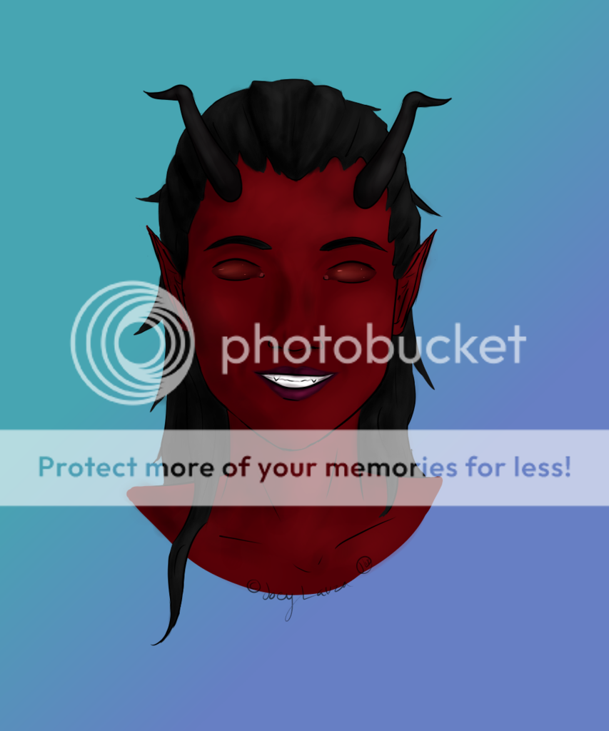
- by Tokkiewokkie |
- Painting And Drawing
- | Submitted on 05/29/2009 |
- Skip
- Title: little angel
- Artist: Tokkiewokkie
-
Description:
now is she colored :)
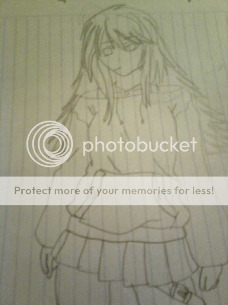
what's better with colors or black/white??
it was the first time that i have colored.
So...... some tips?
please comment xD
- Date: 05/29/2009
- Tags: little angel
- Report Post
- Reference Image:
-

Comments (7 Comments)
- ThetaNine - 05/10/2010
- i think i like it a bit better in black &white...and the wings look...lowish whatever good job!
- Report As Spam
- Playdough Attack - 11/05/2009
- her proportions are odd, and once again, I'd really like to see hands in your drawings.
- Report As Spam
- Cajes the Freak - 09/05/2009
- The wings are too low, her chest is too big, her legs too short, overall it looks odd... keep practicing.
- Report As Spam
- AJiYen - 05/31/2009
- the wings are too low. But i like the coloring.
- Report As Spam
- SHANAbyakuganhyuga - 05/31/2009
- the wings don't look like they're coming out of her back or shoulders... looks weird to me but u pulled it off well. I like it. 4/5
- Report As Spam
- AdL-_-117 - 05/30/2009
-
omg its so good
- Report As Spam
- fghasdf - 05/29/2009
- Aww... I like it. The only thing bothering me is the wings; I dunno why. Maybe it's because I'm used to seeing 'em drawn a certain way or something? Huh. Well, it looks good in BOTH black/white and colored...
- Report As Spam


