- by LaraofSquad6 |
- Photography
- | Submitted on 07/15/2009 |
- Skip
- Title: Shimmy
- Artist: LaraofSquad6
-
Description:
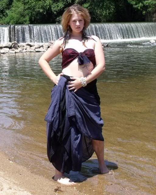
This is a shot of my model Penny Rebel during a photo shoot…this is one of a series of Shimmy:Belly Dancer photographs…This shot is not used in any portfolios of galleries but I like it and I hope you will too...
(Clothing supplied by Pandora)
- Date: 07/15/2009
- Tags: shimmy caroline
- Report Post
Comments (7 Comments)
- Quincy Caroline - 03/18/2010
- I think my hip should have been rotated back, the way it is positioned my entire body looks awkward. Where I am holding the skirt should have been lowered. Where the cropping is I like because it doesn't exclude any of my body parts.I like the earrings. I like the positioning of the skirt, but I wish id had a strapless bra to add some shape on top.. and I don't like the way my foot is rotated in. Pic quality bad bc of resizing. Deviant art would be better, for uplaoding and artistic critiques
- Report As Spam
- ziggynightmare - 03/18/2010
-
maybe the skirt should have been allowed to touch into the water a bit in the back and on the side and have her feet a differnt positions then her face tilted upword a bit
4/5 - Report As Spam
- XxXSurfer_BoiiiXxX - 10/04/2009
- CRAZY EYES!!! AHHH!
- Report As Spam
- humpty_bumpty - 08/12/2009
- great picture! OH! i love her tattoo the dolphins are cool, the scenery is beautiful not to mention the model is gorgeous, her clothes are very becoming of her, and it is really just an all around really good picture keep taking them you are a great photographer!
- Report As Spam
- Zoey_MewMew_Kitty - 07/28/2009
- The picture is alright but needs some work. The expression on her face and her hair is fine. Her feet need to be changed directions and she needs to relax and be more flowy, because belly dancers dance and I see no dancing. Maybe if she let her skirt down the clothes might work but maybe find a different outfit. Keep up the good work.
- Report As Spam
- Saeximm - 07/22/2009
- The position of her feet, the way they are angled is really annoying. She's standing right in the middle of the shot, and that to me is very boring. The idea is amazing, and so is the location, so next time try putting her a little more off to one side, aka look up the rule of thirds and make her pose less awkward. Tell your model to relax and not look so stiff. The combination of those things will do wonders
- Report As Spam
- Lonely-Elena-Forever - 07/22/2009
- the facial expression and the hair is amazing. her skin tone is beautiful. the clothes are lovely but not for her.
- Report As Spam


