Comments (7 Comments)
- Nookicky - 11/27/2008
-
It's alright...
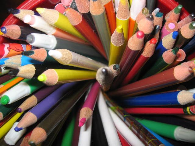
Perhaps brighten up the colours more.
To get a better depth of field, maybe focus more on the middle one. Lookin' good~ - Report As Spam
- xryu kenshix - 11/26/2008
- lol im the only guy that commented on this HA! but it is a good pic i give you a 5/5
- Report As Spam
- Berry Berry Best - 11/26/2008
- nniicce!
- Report As Spam
- Hinatai - 11/26/2008
- i think there is a grey crayon in the mix....
- Report As Spam
- xXemo-princess666Xx - 11/26/2008
- aw love it! i like the one thats inteh center, but i dnt rly lik that sum arent one solid color lik teh rest...and may b u shud crop the top to get rid of some of the black corners since its not at the bottom
- Report As Spam
- bodyslam bailey - 11/17/2008
- pretty good, nice and up close i love this very much
- Report As Spam
- simbabear95 - 11/15/2008
- ello im just bored lolz thats y im sending this 4 gold
- Report As Spam


