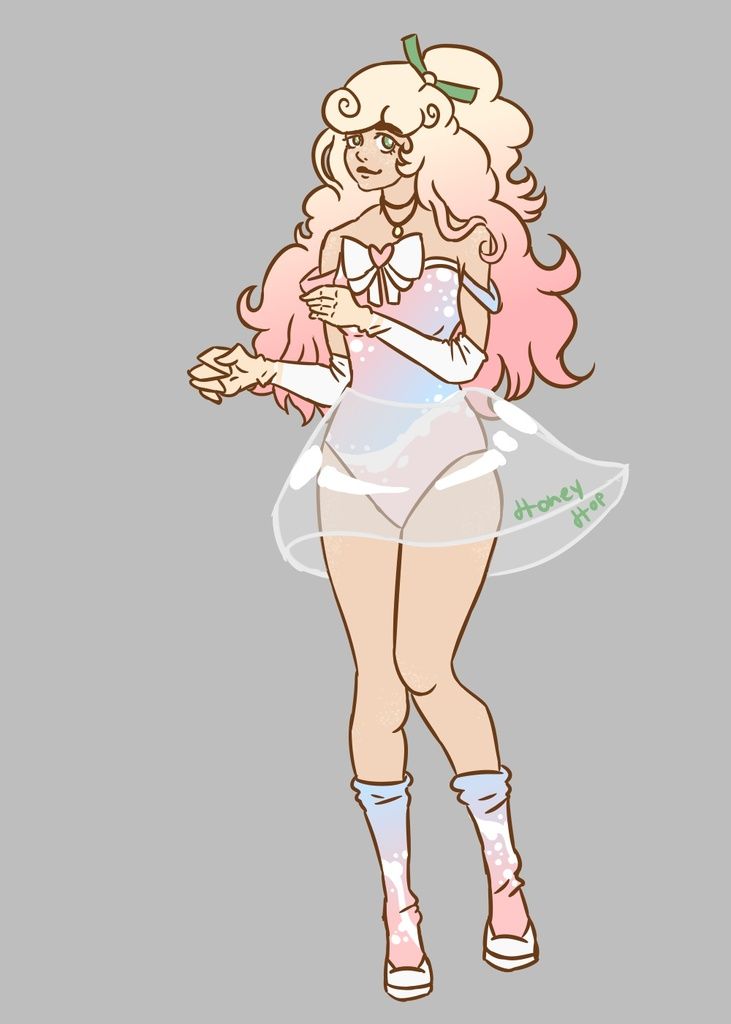
- Title: Generic
- Artist: leavyn
-
Description:
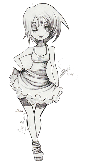
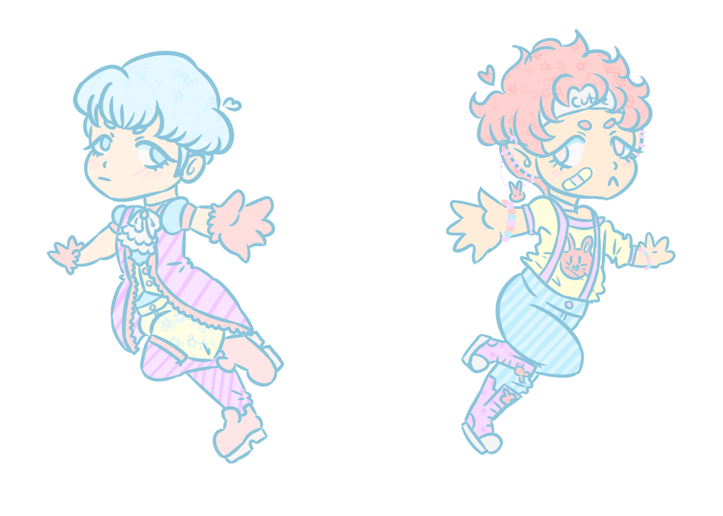
I was trying out a more generic style with this picture. This picture was kind of a combination of a typical anime person and a chibi, so it's why her body frame is so slim compared to the size of her head.
Please note that I know you should be able to see her other shoe and that her left arm is thicker then her right so there is no need to point this out.
Please comment on why you gave me such a rating because I'd like to know what I need to improve on and such. - Date: 02/07/2009
- Tags: generic
- Report Post
Comments (7 Comments)
- iiBabyDoll - 02/08/2009
- love it!!! 5/5
- Report As Spam
- Princess Tessa of Sailand - 02/08/2009
- i like it! the shading of the middle of the dress is really good, and i like how u simplified the dress by making the ruffles look flat. 5/5 one thing u might want to do is make the shading on her legs more gradual.
- Report As Spam
- leavyn - 02/08/2009
-
Thank you all. c:
@ peguin girl:
The way her legs are angled actually isn't weird at all. It's very similar to the position of your legs when you're walking. - Report As Spam
- catholic_demon - 02/07/2009
- lol biggrin cute
- Report As Spam
- iiLil_emo_PuppeTii - 02/07/2009
- it doesnt look weird at all. it looks flirty and normal. if you didnt do what that girl under me siad yu did wrong it would look horrible. but since yu did those things it looks great. my aunt has taught me how to draw nd this is wonderful!! good job nicely done.
- Report As Spam
- peguin girl 333 - 02/07/2009
-
her legs are angled weird, which makes the hips look really weird
if you hadn't pointed out the arm thing, honestly i would never have noticed
(seriously, i'd be guessing for a while) - Report As Spam
- hiyabored - 02/07/2009
- really good
- Report As Spam


