- by colourless_song |
- Painting And Drawing
- | Submitted on 04/04/2009 |
- Skip
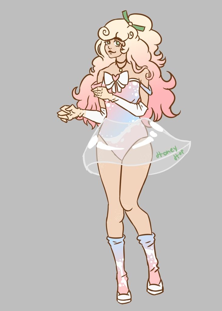
- Title: Eli
- Artist: colourless_song
- Description: this is for a space projec t story for school the female character
- Date: 04/04/2009
- Tags:
- Report Post
Comments (7 Comments)
- MingoSharade - 06/08/2009
- Nice, but the proportions are wrong- the arms should reach about mid thigh, and the elbows should be where you ended the arms.
- Report As Spam
- Zebrick - 06/07/2009
- cool
- Report As Spam
- kiki2blue - 06/06/2009
- @Sukomo: it may be like that, but the whole piece is like that, it gives it a nice effect. Also, she might just curve the paper when she draws and it turns out like that.(I do that all the time) It also gives it a more playful look. I think it's fine. The folds in the fabric is pretty cool too, you know? well, I can't rate it, but I had to say it.
- Report As Spam
- Xx-Lexi HunnyBun-xX - 06/05/2009
- sooooo cool
- Report As Spam
- Ruby Moolah - 06/05/2009
- I really like the general design of the character. The main thing is to keep proportions in mind. ^-^
- Report As Spam
- Sukomo - 06/02/2009
-
too skinny, bad anatomy, face is off, why is she crooked?
well, at least you attempted to color it - Report As Spam
- mclovin9223 - 06/01/2009
- ITS SO SKINNY DO U FEED IT LOL
- Report As Spam


