- by DreamLandMassacre |
- Comics
- | Submitted on 04/20/2010 |
- Skip
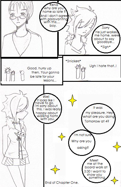
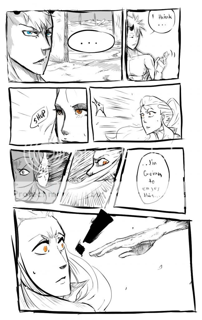
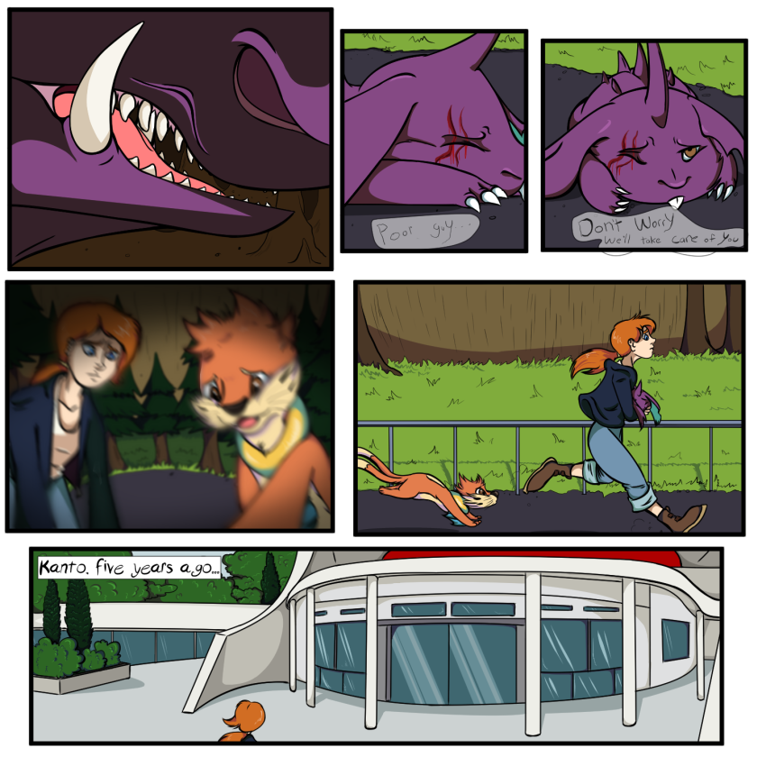
- Title: HandsofFate pg:12
- Artist: DreamLandMassacre
- Description:
- Date: 04/20/2010
- Tags: handsoffate pg12
- Report Post
Comments (4 Comments)
- slip-3bo0odz - 06/14/2010
- so cool
- Report As Spam
- Mezri - 05/19/2010
-
Looks good, you might need to work on some of the grammar and spelling. IE: in the second pannel it should be we're not were. And, the second last pannel it says "homr" instead of "home"
Your art is pretty good but your paint skills need a little work. You could straighten up the lines and, make the text boxes thinner I think it would make the finished product look heaps better. Very nice though. C: 4/5 - Report As Spam
- Christica - 05/17/2010
- The art looks good, save for the second panel. Her head should be a little wider. Just a little ^-^;; I bet, if you had brought the hair on the top-back of her head out just a lil farther it would look good :'3;;
- Report As Spam
- Frost Elemental - 04/20/2010
- Wow, it's awesome, please keep making them, I wanna see the end
- Report As Spam


