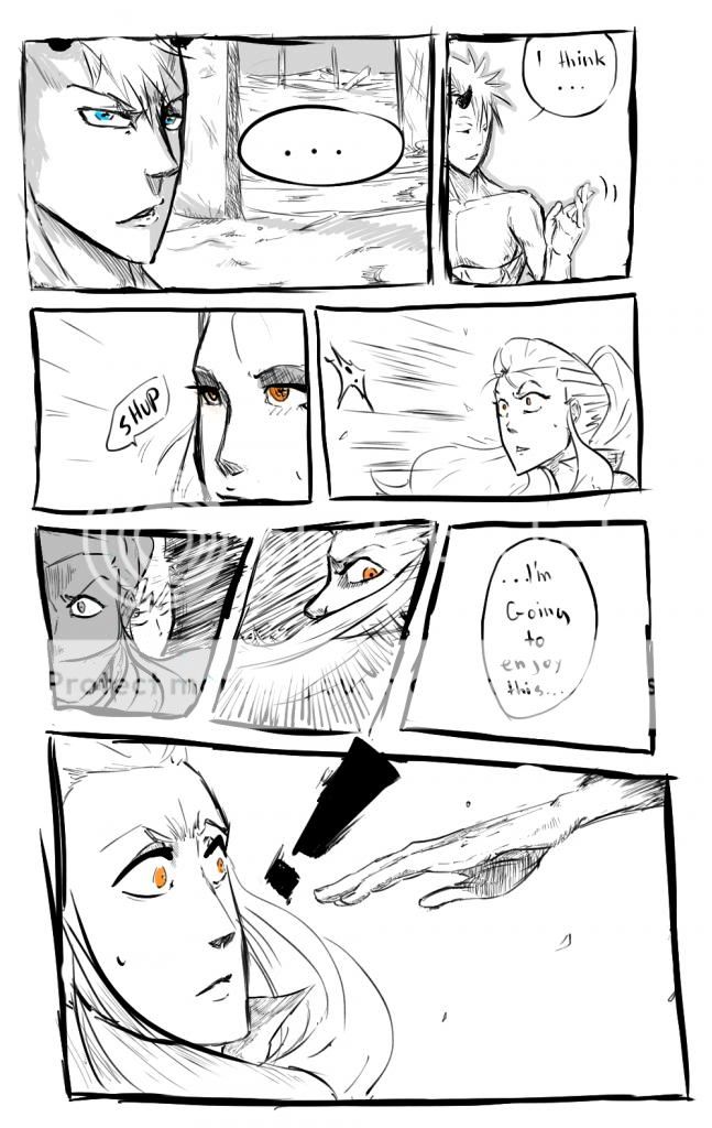
- Title: Raiko tame Sonchi pg. 1
- Artist: Makoonz
-
Description:
the 1st page to my manga
copyright goes all to me - Date: 05/17/2009
- Tags: raiko tame sonchipage1pg
- Report Post
Comments (7 Comments)
- Lorem Corpus - 06/19/2012
- Boob fail...
- Report As Spam
- I Am planetdance233 - 10/20/2009
-
all i can say is boob fail
- Report As Spam
- Crescent Artemia - 08/09/2009
- the silouette looks like she has really big boobs.it doesnt look quite right 3/5
- Report As Spam
- KateMonster x3 - 06/28/2009
- Yes this appears to be more of a prelude, one you would see before a chapter cover. I suggest simply leaving it white for effect, rather than ruining the effect with a fading marker. The silouette IS good, however, add the chapter title in that huge amount of negative space underneath your panels. I almost missed it.
- Report As Spam
- Twisted Starlight - 06/08/2009
- Wow you are a good artist! no offense but the scribbles around the silouette looks a little odd but i give it a 5/5!
- Report As Spam
- try-so-hard5 - 05/23/2009
- wow thats pretty nice, the I give it a 5! awsome shading
- Report As Spam
- Rikku Esteed - 05/22/2009
- love the silouette and the details on the girl in the corner but maybe darken the the inside to about the same tone and it would look better but 4/5
- Report As Spam


