- by Color Please |
- Comics
- | Submitted on 05/01/2009 |
- Skip
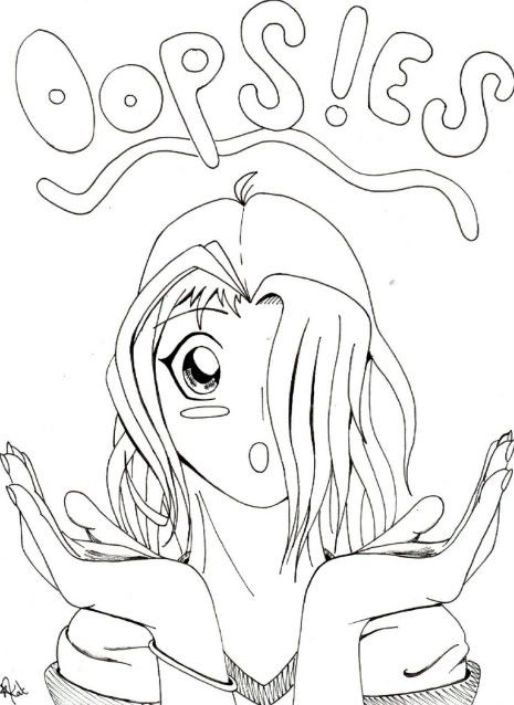
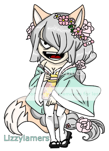
- Title: Oops!es [cover page]
- Artist: Color Please
- Description: This is my comic book cover more to come soon...er or later
- Date: 05/01/2009
- Tags: oopses
- Report Post
Comments (7 Comments)
- incredible Sonic109 - 08/25/2013
-
Lololol it's very cute!! blaugh 4laugh
Not to be picky, but try some shading, you never know ...... rolleyes but really, good job!! - Report As Spam
- mule265 - 10/28/2010
- I like the way her face goes with the tiltle and good straight lines. But . . . her hands to big so 4 . . . and 1/2.
- Report As Spam
- Pantalanium - 02/11/2010
- her hands seem a little bit too big, other than that, looks good!!!! 4/5
- Report As Spam
- Angel Nicholson - 09/06/2009
- I don't see anything wrong with the proportions. Maybe that's just your style. I don't really like the hair on her, but it's not my character lol
- Report As Spam
- iJERK 123 - 08/07/2009
- Cool great!5/5
- Report As Spam
- Twinkle Roseet - 08/05/2009
-
It is very disproportional.
Hands are way to big, and the neck looks like it belongs to a man.
It's great that you're practicing by making a comic!
I can't wait to read it :]
(are you going to color it? because usually cover pages are colored) - Report As Spam
- Kelsey_Got_Swagg - 08/05/2009
- gurl the truth is the is nice i really like it the hands are fine but they are big
- Report As Spam


