- by hug_the_tree |
- Comics
- | Submitted on 07/23/2008 |
- Skip
- Title: Summer Time
- Artist: hug_the_tree
-
Description:
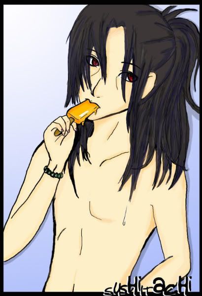
My first art with my gt ;3
(sushiitachis is my name on another side >>") - Date: 07/23/2008
- Tags: naruto
- Report Post
Comments (7 Comments)
- ya_mum000 - 01/09/2009
-
WOW..
pretty intresting.
this guy need six packs, abs and mucles!! LOL
hehhehe... - Report As Spam
- Sex_al Harass__nt - 01/08/2009
- i think its very interesting but accounting from that guy named Devastatingtruth under this coment yea well i dont think he knows how hard it is for drawing anime or manga chibis stuff like that. but still very interesting...i bet it was hard drawing the fingers paportionally(spelling?) my sister is really good but she can barely draw hands but under all that 5 out of 5 and good luck for other postings of your drawings!
- Report As Spam
- devastatingtruth - 01/05/2009
-
I don’t say these things to flame or discourage you, but rather I am giving you this mini-critique based on my own honest opinion. I am pointing out these things so that you can improve and hopefully in the future you will not do the same errors.
[[3of3]]
Sorry for the long multi-comments, I had a lot to say. biggrin - Report As Spam
- devastatingtruth - 01/05/2009
-
It looks rushed just based on the lines being uneven on sides and how some areas have more care and others don't. The eyes look good where as the hand holding the Popsicle is very odd. The finger placement would make it a challenge for anyone to eat that. Also, you may want to give him some more muscle definition. If this is Itachi from Naruto he has more muscle than that. Then again… when some translate images into their own style, muscle structure might not be overly important.
[[2of3]] - Report As Spam
- devastatingtruth - 01/05/2009
-
This is definitely not a comic, so I am not sure why you posted it in this section. This a fan art.
Besides that, let's get into the critique.
You need to work on your proportions. His face is noticeably too big for his body. To correct this you may want to look at some reference images of actual people to get down how the figure breaks down proportionately. For the CGing, I would suggest slowing down some.
[[1of3]]
- Report As Spam
- Fairee Lumineuse - 01/05/2009
- This is in the comic section?
- Report As Spam


