- by Color Please |
- Comics
- | Submitted on 05/01/2009 |
- Skip
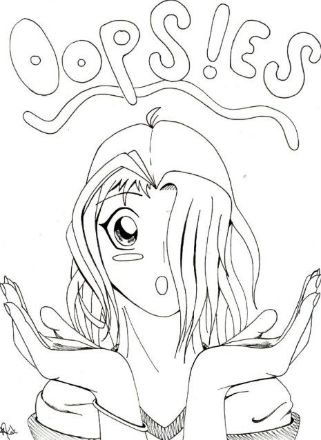
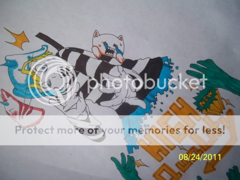
- Title: Oops!es [cover page]
- Artist: Color Please
- Description: This is my comic book cover more to come soon...er or later
- Date: 05/01/2009
- Tags: oopses
- Report Post
Comments (6 Comments)
- Gustav Hield - 07/30/2009
-
Practice more on drawing proportional parts. The hands are too big and the neck is too wide for the head. More or less, keep practicing^^ i'm sure you can do better than that. Make me proud! 3/5
One advice, don't let other people tease or make fun of your drawing. Whoever does that is like s**t. - Report As Spam
- P47WarHawk - 05/28/2009
- the hands might wanna have more work done on them because the pinky's knuckle is a bit big... other than that great job and good luck on you're comic! =D
- Report As Spam
- Misukyuu - 05/28/2009
- Oopsie? What went wrong?
- Report As Spam
- Somber_isis_Queen - 05/07/2009
- HOLY s**t HER HANDS ARE HUGE. make them smaller.
- Report As Spam
- Castle Mistress - 05/05/2009
- Cure, the eyes are adorable! though it kind of looks like the hands are huge compared to everything else
- Report As Spam
- The Painted Potato - 05/01/2009
- nice fringey thing
- Report As Spam


