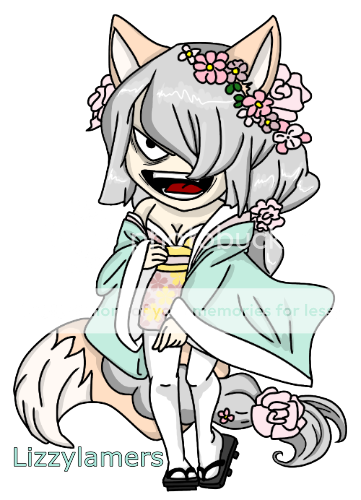
- Title: F-Design
- Artist: rliu
- Description: It is kind of chinese fashion xD
- Date: 12/07/2008
- Tags: design
- Report Post
Comments (7 Comments)
- HolliexDemonic - 10/13/2009
- Pretty good :
- Report As Spam
- my - g a l a x y - 10/01/2009
- its great just darken the face a little
- Report As Spam
- Bookfort - 09/05/2009
- cool
- Report As Spam
- iVampire R U E X - 08/02/2009
- Not bad, but her legs makes her way too tall. I like though. 3/5.
- Report As Spam
- abbacon - 07/15/2009
-
i can see how you tried to make the face stand out a little less than the clothes, but it kinda doesn't look right
maybe a slightly lighter pencil than used on the clothes for the face - Report As Spam
- fujiro_usagi_ji - 06/14/2009
- Other than that, this is very impressive and I do hope to see this and future designs catwalk down the runway. ^-^
- Report As Spam
- fujiro_usagi_ji - 06/14/2009
- I have to agree with ehNu about the legs. Dun get me wrong! The design itself is terrific (more like a modern british look than chinese, though). But her legs are quite large for the body and design. If you were to cover up from the hips down, it looks more like the woman is posing comfortably. But the legs are so large , it takes away from the design. The legs are moving, but the top of the body doesn't move with it naturaly. Just a little less leg is all im saying.
- Report As Spam


