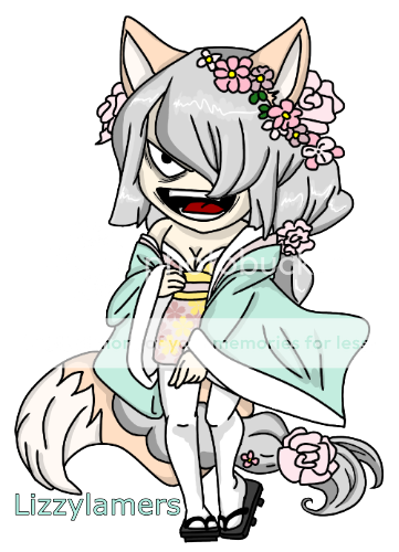
- Title: F-Design
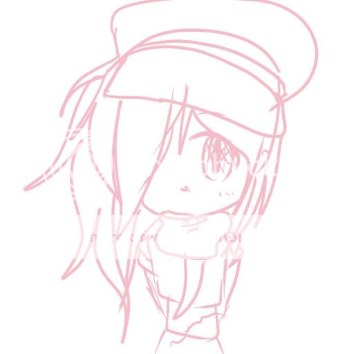
- Artist: rliu
- Description: It is kind of chinese fashion xD
- Date: 12/07/2008
- Tags: design
- Report Post
Comments (7 Comments)
- Peazzthefirst - 01/21/2009
- ummmm....wher is the face
- Report As Spam
- ehNu - 01/13/2009
-
Proportionately the figure is off; her legs are too long. Watch for that in your future images, it is good practice even in your draft work to keep it proportional, unless you are intentionally going for that non-proportional look. Work from life drawings to help you get the proportions down.
Also, please do not post sketches for designs in the Comic Section, it is really bothersome and will anger other users.
If ever you want further feedback feel free to PM me. ^_^
[[2of2]] - Report As Spam
- ehNu - 01/13/2009
-
rliu: I don’t think that is the best method to go about designing an outfit. If you are going to have more concentration on the clothing make the figure even less detailed but not half way. When you have the outfit having a more finished quality and the face lacking, it looks like you got lazy. I am not saying this to be mean; I hope you don’t skew it that way.
[[1of2]] - Report As Spam
- i am with u all the way - 01/10/2009
- I like it biggrin
- Report As Spam
- Blonde_wit_brains - 01/06/2009
- love it! 5/5
- Report As Spam
- that stark boy - 01/05/2009
- thats so cool i like it but i thing you should do more shading on the head couse it looks little faded away...
- Report As Spam
- October098 - 12/22/2008
- THIS IS THE COMIC SECTION!!DOES THAT LOOK LIKE A FLIPPIN COMIC TO YOU!!
- Report As Spam


