- by YukariKotoko |
- Comics
- | Submitted on 07/17/2008 |
- Skip
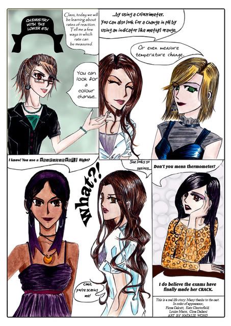
- Title: Chemistry lesson
- Artist: YukariKotoko
-
Description:
This is what happened in a chemistry lesson at the end of term....drawn and painted by hand, then cleaned in photoshop and text done in photoshop. Sorry the background is a little plain!
Heres the link to a larger version of the pic~ http://i14.photobucket.com/albums/a303/_Kiara_Sota_/Natalie-school-magazine-1.jpg - Date: 07/17/2008
- Tags: chemistry joke
- Report Post
Comments (7 Comments)
- x-A S i A N B O O - 06/19/2010
-
Wow yhuurrr Gooood<$
- Report As Spam
- Neon Papercuts - 04/19/2010
-
Lovely, nicely done! the drawings are amazing! Fav for sure!
10/5 - Report As Spam
- iProfessor Juniper - 01/31/2010
- Well done
- Report As Spam
- kollegah79 - 11/14/2009
- . its pwerfect smile
- Report As Spam
- Wishful Desire - 08/01/2009
- THey're gorgeously done.. but I feel like something's missing.. something that Matthew has already pointed out. sweatdrop
- Report As Spam
- Matthew Jason Foxx - 07/13/2009
-
And the bottom left frame doesn't read quite "comicbook-right". The rest of the frames feel like comic book, but the bottom left feels like you just drew girls!! Now, they're -veeery WELL- drawn girls... but it just doesn't feel like it's from a comic book.
I like your work! It's very beautiful! you don't have comic-book style down just yet. You'll need to work on the flow of pictures and text into a readable storyline, but don't quit!! You have potential. - Report As Spam
- Matthew Jason Foxx - 07/13/2009
- I can't read this!! ;-; The writing is hard to read, first off and the "tempometer" line, b/c it is so important... needs to be written more clearly --though I liked the fact that you used a different, weird font for it. I wouldn't change that, just find a more readable font. x_x
- Report As Spam


